

American Express - VisID
Finance can be an intimidating industry, one where things can feel cold and daunting. When we were approached to pitch and develop the visual identity for AMEX our goal was to ultimately position American Express as the powerful backing and infrastructure behind every meaningful moment between big milestones to small everyday joys.
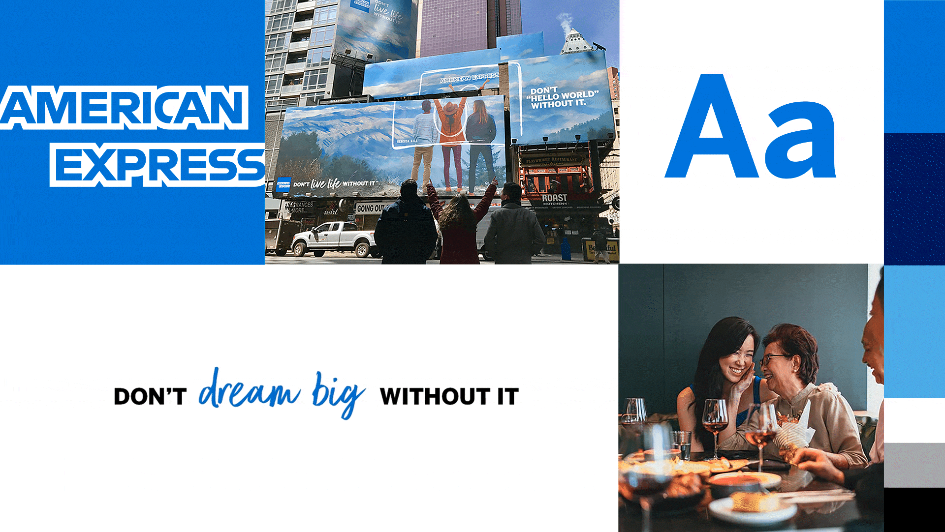
We evolved their brand system with sprinkles of hand-drawn elements that adds an important human layer. It softened the precision typically associated with finance and signals flexibility, warmth, and individuality. This juxtaposition structured financial credibility with organic, human expression and helped reposition AMEX as both trusted and approachable. A system that is built for real people doing life with American Express.
My Role
My role was to work closely with design and creative teams to help define the look and feel of the “Don’t Live Life Without It” campaign.
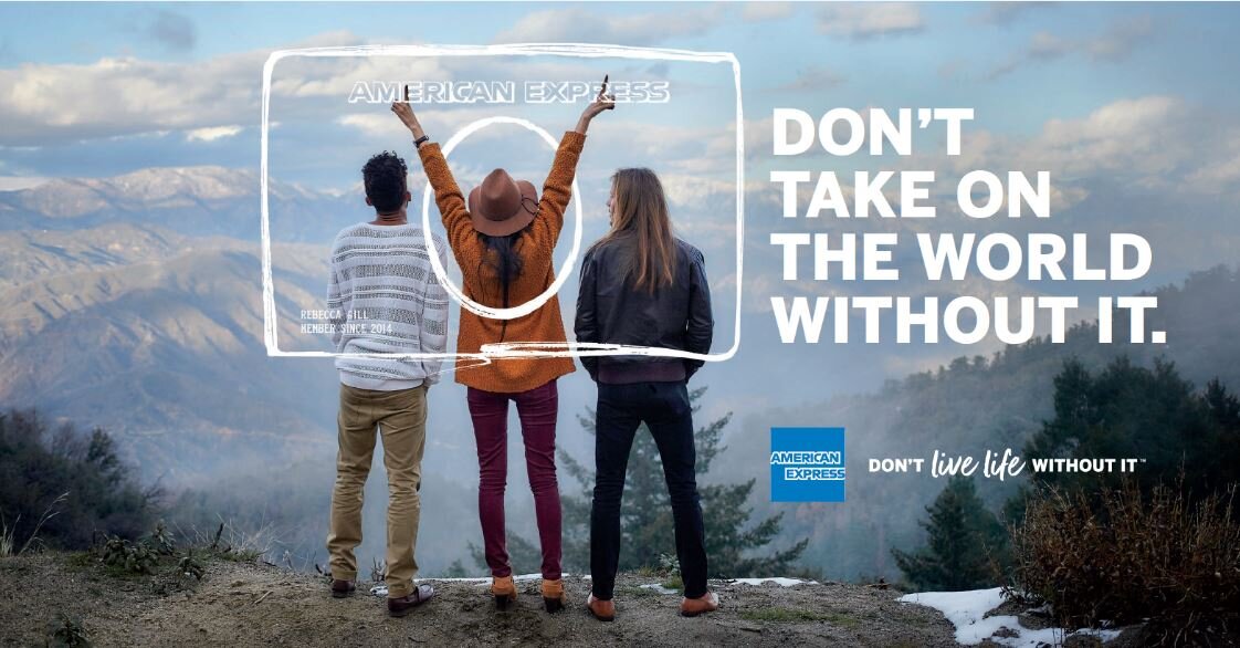
We handcrafted the visual language, creating a series of hand-drawn card graphics across multiple states that were later refined and vectorized for scalable use. This approach introduced a sense of warmth and imperfection, helping to humanize the brand and make financial services feel more approachable.
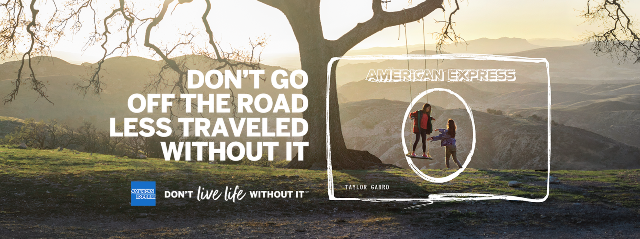
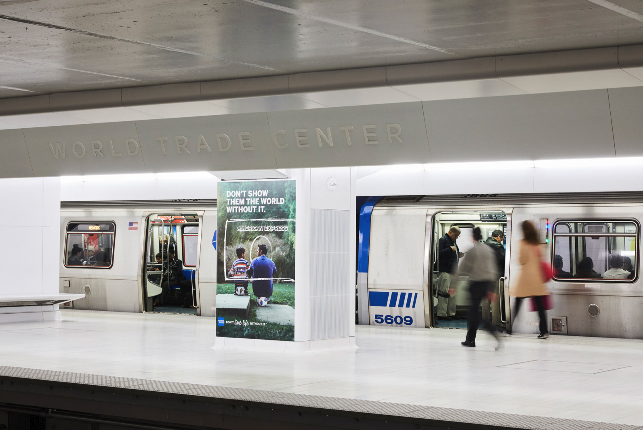
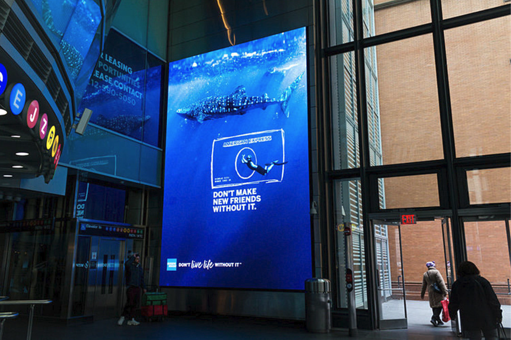
A key part of the visual language is the card graphic. We spent a period of time hand drawing a wide range of card graphic explorations, each tailored to different intentionally varied line weight, texture, proportion, and framing, creating options that could feel more energetic and expressive for lifestyle-driven moments, or more refined and structured for premium and business-focused applications. This allowed us to build a system that could flex across audiences while still feeling cohesive.
From there, the analog sketches were digitized, carefully preserving the imperfections and character of the original drawings. The goal wasn’t to overly polish them, but to strike a balance that maintains the authenticity of the hand while ensuring scalability, consistency, and usability across channels.
This process ultimately resulted in a modular toolkit of card graphics that could adapt to different narratives and markets, while reinforcing a singular idea: that American Express is a constant, human-centered presence across every dimension of life.
In parallel, I contributed to a typographic exploration that ultimately incorporated handwritten elements into the tagline itself. By allowing part of the line to feel like a personal sign-off, we added a subtle but powerful human touch, reinforcing the idea that Amex is not just a financial tool, but a trusted companion embedded in everyday life.
I also helped define a photography direction that blends aspirational and intimate moments, capturing both ambition and connection. By integrating the card frame into these scenes, the system communicates that Amex isn’t separate from life but it’s embedded within it.
Overall, my work contributed to a visual system that maintains the AMEX premium equity while making it feel more human, relatable, and ever-present, shifting the brand from a transactional tool to a trusted partner behind meaningful experiences.


Agency: DentsuCreative Team: Kurt Fries, Zulema Orozco, Jojo Uhila & Tracey Wong