

Ahold Delhaize PRISM Design System
Standing out as a brand on a templated platform and having custom elements can be tough from a systematic approach, but there are ways to build brand recognition when using a design system. Using existing brand elements from Stop & Shop, Giant Foods, Food Lion and Giant Company I was able to create and organize a design system that fits into the PRISM hosting environment, while maintaining individual brand personalities. By leveraging each brand’s independent colors and brand voice, I created icon sets, image assets, animations and videos, supporting their unique branding while being hosted on the same platform. In tandem, I flagged opportunities for new features that met both business and customer goals, such as driving up revenue, meeting sales goals, and adding moments of delight for our shoppers.
My Role
Creative Direction
Set the creative direction for brands under the Ahold Delhaize umbrella.
Oversee designers, art directors, copywriters and developers to ensure brand standards are followed
UIUX Design
Wireframe and designe new product features that are user friendly, added delight to the user journey and drove revenue for the business, while staying on trend with what’s current in ecommerce
Animation & Video
Created prototypes and future feature demos for senior leadership and stakeholders.
Designed and animated icons for our categories and aisle experience.

A Little Overview
We've identified four main areas that require immediate updates to the Ahold Delhaize PRISM Design System, based on observation and research. We took a holistic approach to reimagine the design system and delivered a more personalized o brand omnichannel experience.
By incorporating brand design elements, modern design techniques and marketing strategies to create a compelling, integrated brand experience that considers both customer and business needs.
Objectives:
Evolve the design system to optimize asset creation & improve consistency
Elevate the user experience to drive the ATC & user engagement
Future-proof design and create brand & business flexibility

Areas of Focus
Compelling interactions
Meaningful, interactive enhancements help deepen user engagement
Improved CTR/ATC
A more modern, delightful overall experience
Recognizable branded theme
Omnichannel experience will build familiarity
More ways to shop, including in-store/online shopping crossover
Improved brand visibility and awareness
Consistent design system
Focus on design optimization & consistency
Faster, easier implementation
Business growth & potential
Additional monetization opportunities
Space for inspirational marketing content
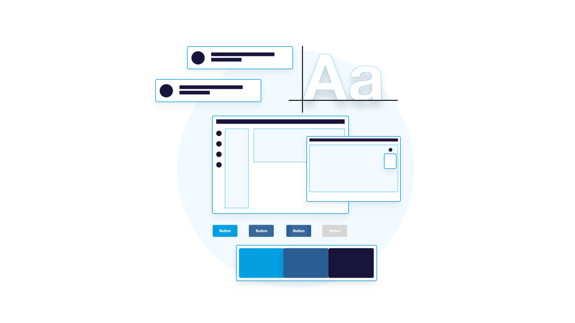
A consistent design system establishes rules and standards that apply to all UI patterns and components. These standards help enhance the digital experience, showcase the brand's personality, drive consistency and efficiency, and introduce interactive experiences.
Our inspiration comes from customer shopping patterns, on going research initiatives, and the brand marketing calendar, which help inform our themes and use cases.
The full Design System Management (DSM) includes:
Full color palette, with color functions to improve accessibility and usability
Design scenarios and style guide to optimize asset creation process
Improved typography treatments to create strong brand impression and elevated ADA standard
UI pattern library with improved usability
Visual Direction
We evaluated the existing style guides and brand assets, and recognized an opportunity to elevate visual direction and create a cohesive omnichannel design. This will better connect the in-store and online presence and improve overall brand recognition.
Visual Updates & Highlights:
Differentiate utilitarian icons from inspirational icons to support functional and creative objectives
Utilize secondary brand colors to improve accessibility & brand personality
Optimize web color palette to create more inspirational color combinations
Introduce brand personality to web experience to create a more cohesive, recognizable brand experience
Leverage data and research to improve UI/UX
Identify testing opportunities to ensure visual direction resonates with customers

Colors
Color to Functions
Giving colors a purpose to better communicate information hierarchy and interactivity with our users and enhance their shopping journey.
Primary Colors
Interactive items should be identifiable and clear, by assigning our actionable elements to our brand colors it creates brand recognition and communicates actions that users can take throughout their journey. Action Colors communicates actions users can take.
Secondary Colors
Using primary colors to create shade variants that can be applied in different ways to design patterns and indicting where things are interactive on the page, such as hover and focus states.
Global Colors
Global neutrals will apply to all four brands under the PRISM design system, making it easy for both designs and developers to pick up. Where before the system had over a dozen greys, we simplified our existing grey tones, creating a neutral color palette consisting of five shades. These shade are used for text, organize content into distinct zones and clearly communicate disabled states.
Our neutral text colors aid in creating visual hierarchy and communicate to our users an order of importance. For example, our headlines use neutral (black) and body copy uses a neutral 1 (darkest grey). They should aid and not distract from the primary actions we want users to take.
Global messaging colors will also live across all four brands. Using colors from our existing secondary color palette to create four distinct colors used to communicate error, warning, success and informational messaging to our users.

Seasonal Colors
Additional colors were found under secondary color palettes within the existing brand style guides, each brand has their own set of unique seasonal colors but were not set up for web or marketing usage.
With this in mind, we made slight adjustments to the seasonal colors, making them more vibrant and compatible both print and screens.
These color palettes can be used in various marketing materials for seasonal campaigns, additional brand initiatives such as focusing on health & wellness as well as illustrations and icons.
Colors can also be paired with photography, keeping in mind not all colors within this palette need to be used because the various tones can be naturally found in lifestyle or product photography.
Beige is omnipresent within photography and color palette, balancing the various color combinations

Typography
The previous type styles had an overwhelming amount of weights and sizes and lacked visual hierarchy, the typography were also the same across all brands, lacking in personality. We wanted to take this opportunity to bring our brand fonts into the mix to cover a wide range of weights and sizes, from functional to expressive, creating visual hierarchy.
We organized type styles into H1-6 to cover both desktop & mobile creating consistency across web and app we can organize copy in a way that makes it easy for our users know the order of importance within various components during their shopping journey.

Iconography
One of the big pain points across all brands was that all the icons across the PRISM experience were exactly the same and lacked brand personality. There was also no differentiation between functional icons vs brand icons.
With the updated navigation design, we wanted to add moments of delight for our users and expose our categories for a better browser experience with category icons.
Using the primary, secondary and seasonal colors from the individual brands to create icon sets for the categories that will help give them a more unique feel and create brand recognition.
The icon sets also come with animated versions that show when users hover over the specific category, indicating that the icon is clickable.
Stop & Shop Icons


Patterns at a Glance
From the very beginning one of our user pain points were not being able to identify buttons and links, users had no idea if a button was active or disabled. With a revised functional color palette and typography system we were able to improve our UI patterns to clearly communicate various actions and states to our users, creating clear distinctions between primary and secondary buttons, active links and tabs.
We assigned the primary brand colors to be associated with active buttons and links while their shade variants communicated hover and focus states. We also added simple animations to further communicate when specific items were interactive. This made wayfinding and the overall user journey less confusing and easy to navigate.
Storytelling
Knowing one of the key pain points from the brands was the lack of brand personality and relatability, we took this opportunity to add more personalized content and design will better align the brand's online, in-store and social presence. This will make the brands more approachable and understandable, ultimately helping bridge the gap between in-store and online shoppers.
In addition, every design and content decision will fit the brand's personality.
Storytelling initiatives:
More relatable imagery
Branded illustrations to highlight key initiatives
Effective content to complement UX features
Inspirational content and components
Personalized copy & content throughout the experience
Conversational, relatable content
A thoughtful content hierarchy that walks customers through the experience and tells a clear brand story

Monetization
Brands partner with various vendors on promotions and marketing materials. We wanted to add additional marketing components that allow brands and vendors to seamlessly promote products and simplify the customer flow. This monetization opportunity will lead to additional revenue, tighter brand and vendor relationships, higher conversion rates and a larger basket size.
Monetization components will include:
High-quality photography and video
Inspirational content written with brand voice and tone in mind
Consistent component design that fits with the overall page/brand design


Homepage Redesign
Now that we have the ingredients, it’s time to put it all together. When thinking through how we wanted to redesign the homepage, we noticed that there weren’t features in place to entice, engage and inspire users. Inspiration and brand personality were two main pain points we heard from brands and knowing that we wanted to add new features that would show our brand personality and inspire our users, increasing our click through and add to cart rates.
From function to inspiration
The digital experience could be significantly enhanced by establishing a more distinct brand identity that highlights the unique attributes and values that set Stop & Shop apart from other brands. The new creative direction focuses on telling the brand story and immediately communicating the distinct brand value.
Creative storytelling techniques inspire users to take action, especially when paired with user experience enhancements that make it easier for people to find and buy what they need.
Experience highlights:
Redesigned KWM
Data-driven content strategy
Optimized UX and navigation
Monetization opportunities
Inspirational content & components
Increased personalization
Creative storytelling

The Team: Anthony Chilelli, Shu Tang, Derrick Bettis, Mac Smith and David Ayllon