
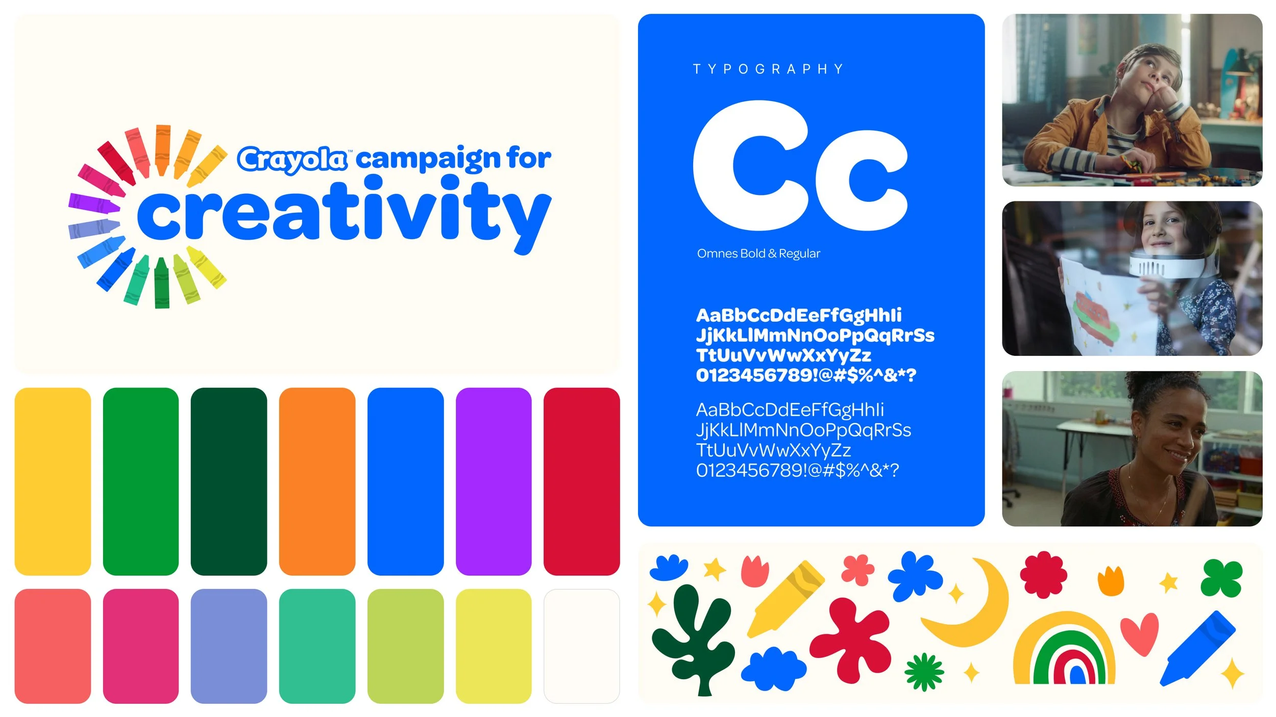
Crayola Campaign for Creativity
The Crayola Campaign for Creativity celebrates the power of color as a catalyst for imagination and self-expression. Rooted in Crayola’s iconic crayons, the visual identity champions creativity as one that nurtures curiosity, builds confidence, and connects people of all ages through shared moments. By transforming the familiar crayon shape into a vibrant color wheel, the campaign symbolizes the infinite ways creativity can spark from a single tool and radiate outward, inspiring joy, connection, and endless possibilities.
My Role
A huge part of this campaign is based around this idea of creativity, connection and nostalgia. Crayola wanted to connect adults with their childhood creations and dreams as part of the larger campaign through social and experiential foot prints therefore a visual identity that could flex across all channels was needed.
My role was to work with creative directors and clients to develop and implement a visual identity for the Crayola Campaign for Creativity that could work throughout an omnichannel experience. The goal was to highlight that creativity celebrates and connects people not only with each other but with their emotions and core memories.
VisID
Using the iconic Crayola Crayon that we all know and love as the primary inspiration to create a dynamic system that hit on the endless of possibilities and playfulness that Crayola offers.
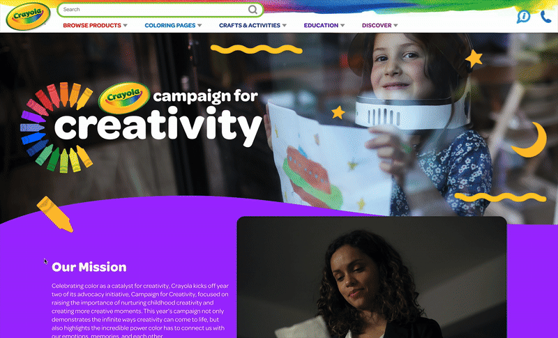
UIUX
Wireframe, prototype and design a landing page for the campaign using the design system we developed that fit the brand’s colorful and playful nature.
Style Guide
Create a style guide that explained the visual language and usages for Crayola’s internal team and other agency partners.
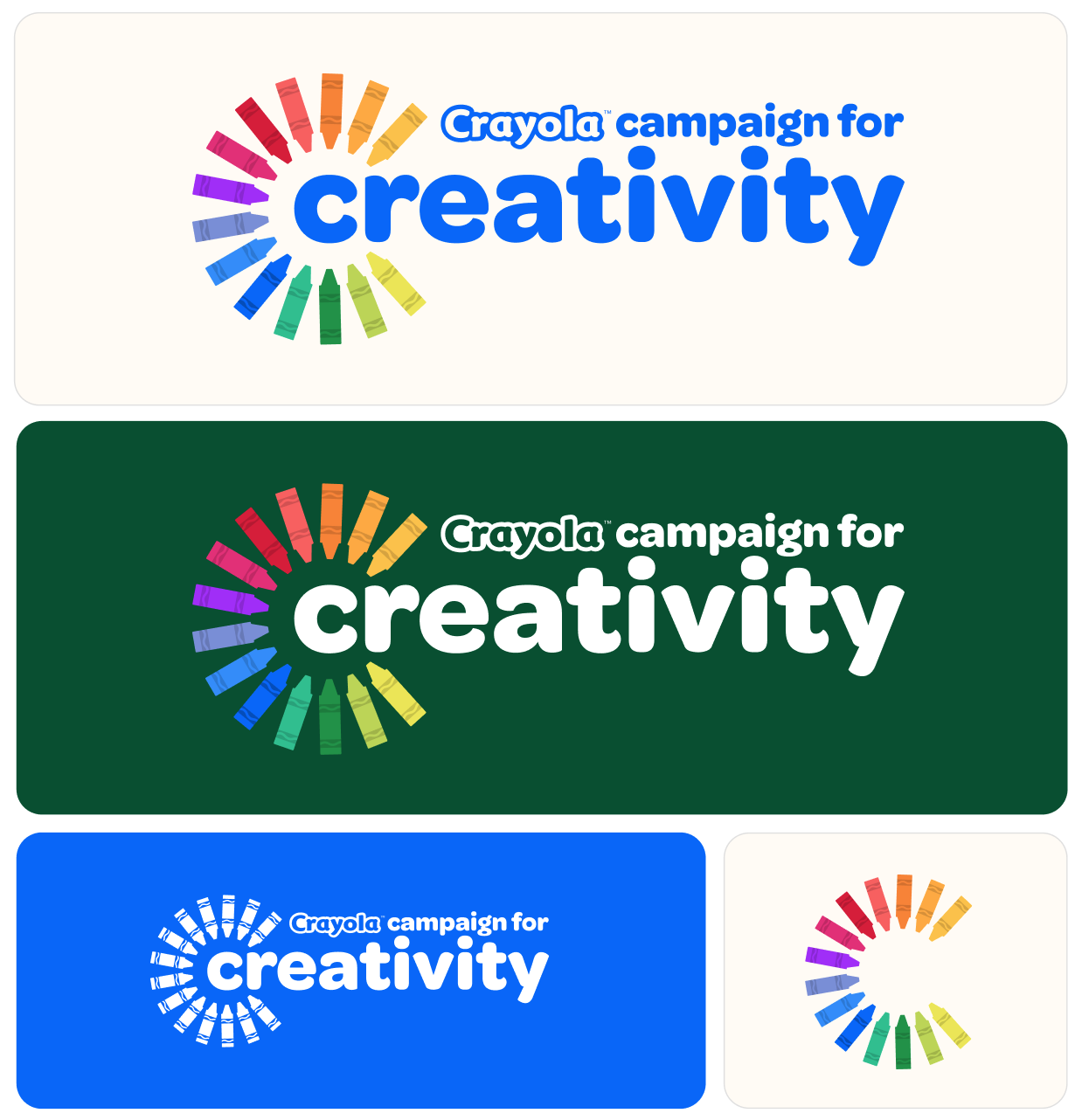
The Logo
The Crayola Campaign for Creativity logo lockup celebrates imagination by using the brand’s most iconic element, the crayon. The crayons not only form an inclusive color wheel that radiates energy and possibility, but they are also a symbol of nostalgia, connecting us with endless imagination from we were kids and even into adulthood. The crayon designs also feature the recognizable Crayola Serpentine that wraps around all of their products and packaging, making this logo mark ownable to the brand. This structure conveys the idea that creativity begins with a single crayon yet expands outward into endless forms of expression.
The different variations in logo marks offers a system that allows for flexibility in various situations:
Full Lockup : Used in primary forms of communications and maintains brand recognition.
Dark Background Variation: Maintains vibrancy while adding depth and contrast, ensuring the color wheel retains its inclusivity and dynamism across contexts.
Single-Color: Extends brand usability into simplified applications while retaining the serpentine “C” crayon device as a recognizable symbol.
Isolated “C” Mark: Functions as a standalone graphic, distilling the campaign into its purest visual form while remaining recognizable.
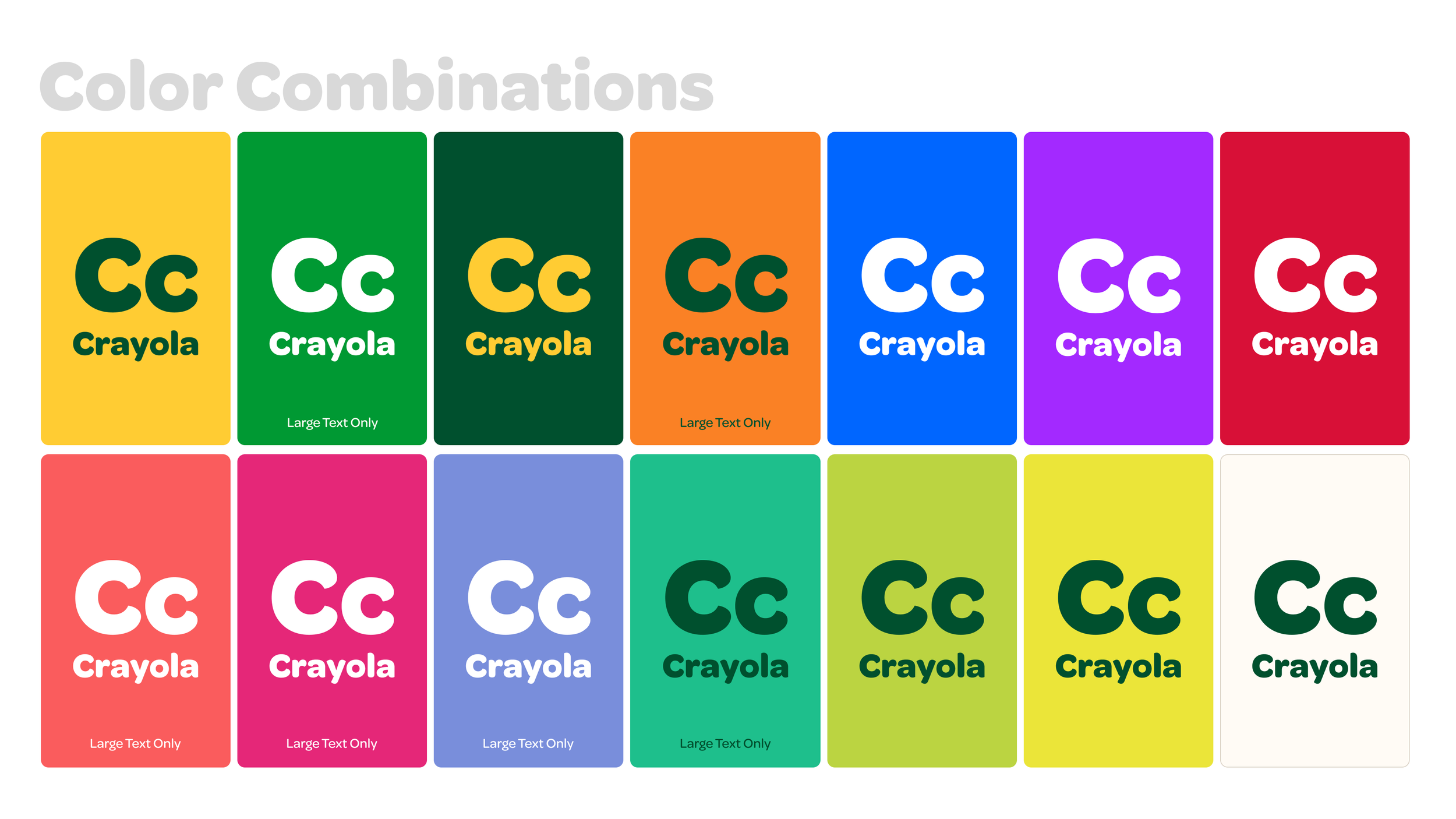
Colors
The Campaign for Creativity color palette celebrates Crayola’s heritage of bold, expressive color while providing the flexibility to adapt across audiences and contexts. The primary palette captures the vibrancy of the Crayola’s endless colors, working together to symbolize the infinite ways creativity can spark and expand outward. These high-contrast hues reflect the campaign’s central idea that creativity begins with a single crayon and grows into boundless expressions.
The secondary palette extends this foundation with softer, complementary tones that bring warmth, versatility, and balance. Together, the palettes offer both bold impact and nuanced flexibility, ensuring the campaign can flex between playful childhood energy and thoughtful advocacy moments while always keeping color as the catalyst for creativity.

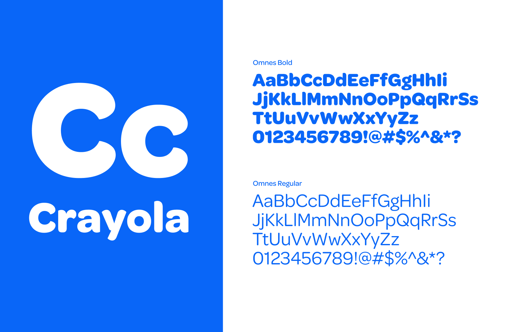
Typography
The campaign uses Omnes, Crayola’s brand typeface, to ensure consistency and strong brand recognition. Omnes’ rounded, soft letterforms mirror the approachable and playful qualities of Crayola’s crayons, making it feel welcoming to children and adults. Its geometric curves carry a sense of modernity while staying warm and human, reflecting the campaign’s mission to inspire creativity across generations.
To build clear hierarchy, the campaign leverages different weights of Omnes, using Bold for emphasis and headlines, while Regular supports body copy and secondary messaging. By sticking with a single family, the typography remains ownable to Crayola, balancing consistency with flexibility, and reinforcing the campaign’s identity as colorful and creative.
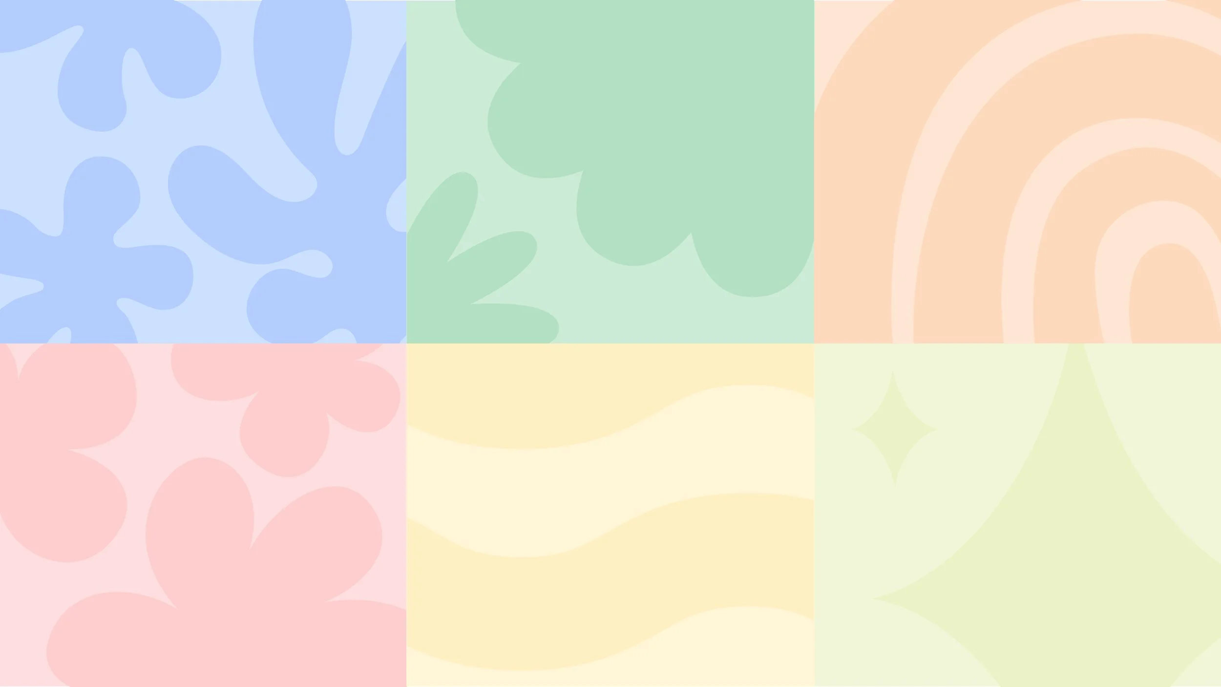
Doodles & Patterns
The illustrations for the Campaign for Creativity draws directly from the uninhibited spirit of childhood art, simple, bold, and full of imagination. Using shapes inspired by clouds, flowers, stars, rainbows, and nature, the graphics echo the spontaneous way children create, celebrating freedom of expression without rigid rules. The crayon motifs serve as a grounding reminder of Crayola’s iconic tool, reinforcing the campaign’s roots in creativity that begins with a single crayon.
The serpentine wave pattern, derived from the campaign’s core identity, adds rhythm and energy across applications. Its playful repetition mirrors the fluidity of imagination and acts as a connective thread, tying together various campaign elements. By combining organic, childlike forms with the structured serpentine device, the system strikes a balance between whimsical creativity and brand cohesion, making the visuals instantly recognizable as Crayola while inviting audiences into a joyful world of color and possibility.

Applications

The Team: Brian Eden, Harper Barth, James McCawley